PROJECT THREE - CDI
ASSIGNMENT:
EDITORIAL LAYOUT
OBJECTIVES:
Using a variety of typography and imagery, produce a two-page layout which demonstrates good composition and clear hierarchy of information presented.
DESCRIPTION:
Over the past few weeks you have learned the basic principles which guide the work of the visual communicator, your task now is to really explore what it is you’re communicating and how you’re communicating it.
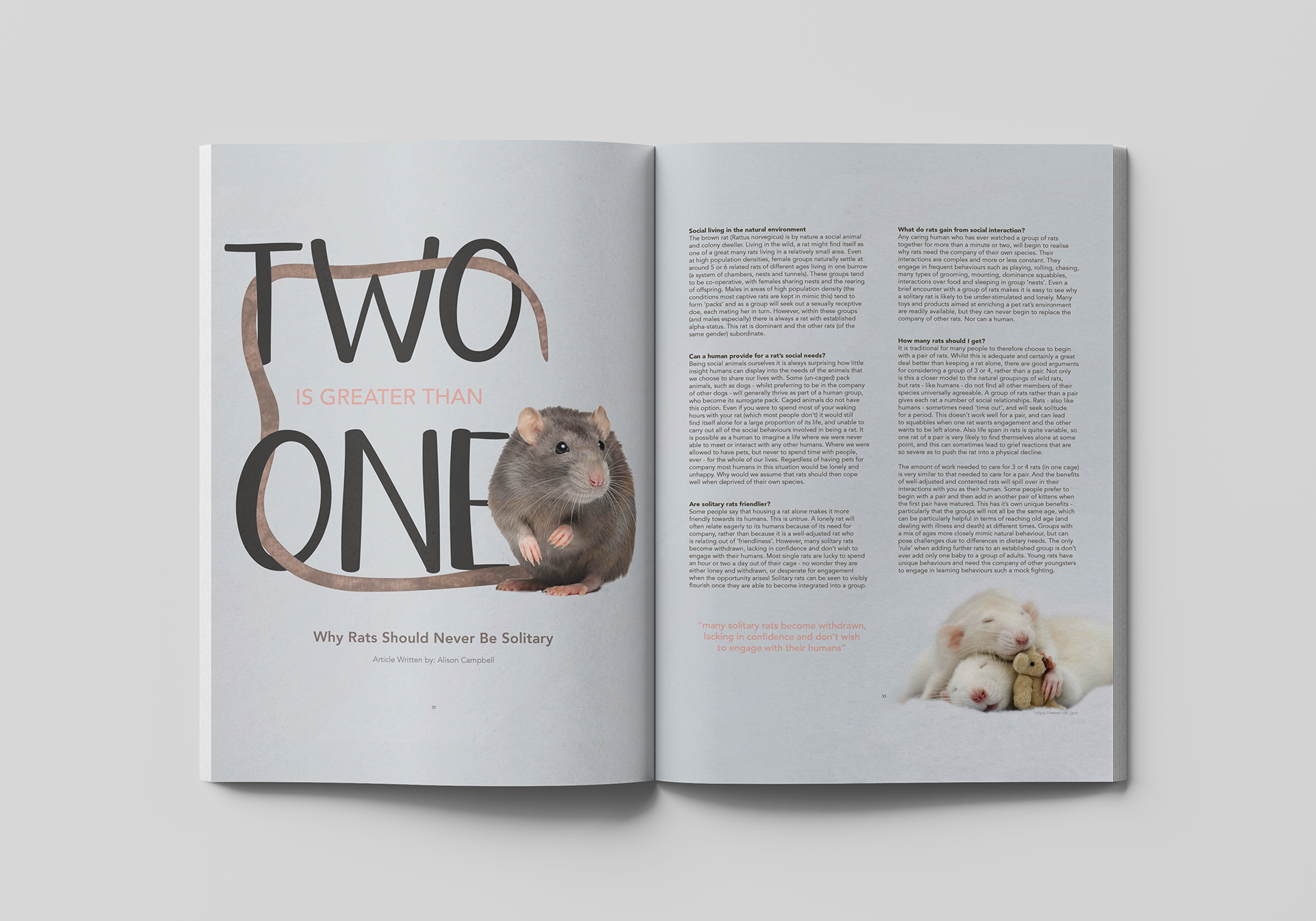
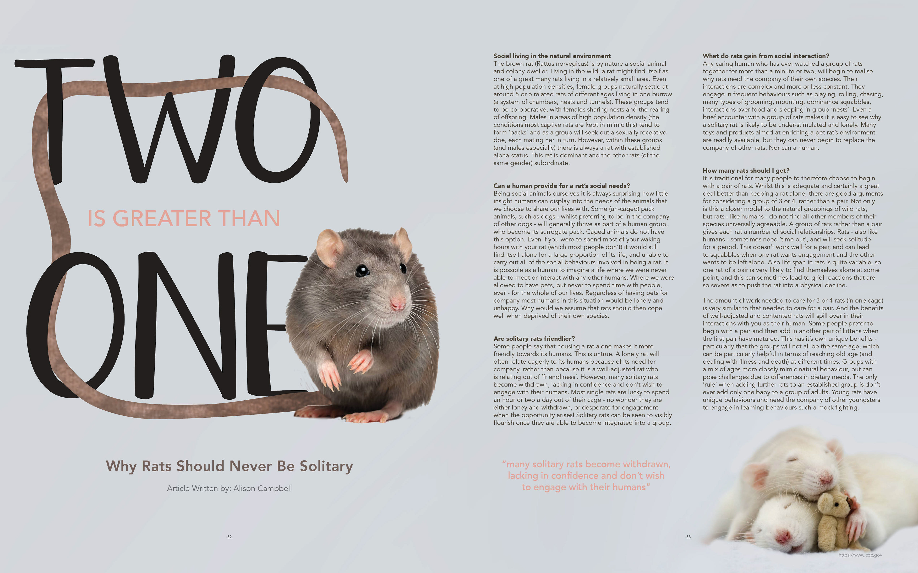
Incorporating all of the things you’ve learned and the items we’ve been discussing, you should design a color 16" x 10" layout (two 8" x 10" pages). Your design may be either type or image dominant, but must include at least two images, headline, subhead, pull-out quote, 750–1,000 words of body-copy, at least one caption and page numbers. All information must read and make sense. The pages need to work together as a unit.
Begin by developing a grid. More columns will give you greater flexibility, but will also offer more complexity in your layouts. Start with at least three columns, and remember to leave larger margins on the outside edges of your page and smaller margins on the inside where the two pages meet.
The subject matter of the article is your choice, but it is up to you to do the research and present the ideas in a comprehensive manner. The text may be pulled from a variety of sources, but should be cohesive and coherent.
As you consider design, remember that the pages must function in unity—they should work together as a visual unit and there must be structural integration as well. If you want one page to work as image, and one to use only typography, how will you make them unify with one another? Consider typefaces which bring harmony to the composition; which bring type and image together; which convey the ideas of your chosen subject. How about color—how will it convey an atmosphere or mood to your layout? Each decision must be well thought out.
FINISHING:
Final designs should be high quality color laser prints trimmed to just outside the framal reference and then mounted on 20" x 16" black board (2" border on sides, 2.5” top and 3.5" on bottom).
MONDAY:
1st: Continue researching topic visually, as well as searching for appropriate body copy. Think broadly about your topic, but also pointedly. Research AROUND your topic.
2nd: Create Mood board.
FOR MOODBOARDS:
11"x17" - Horizontal
What magazine/ journal/ publication are you designing for?
What is the TONE? Martha Stewart Vs. Flaunt
3-ish fonts:
1 Display/ Headline font
2 Sub fonts/ body copy fonts
(If you are going to hand-render, show an approximation of what you are going for)
4-ish colors:
Base/ Nuetrals
Low tones
High tones
Images:
These do not need to be final images. Remember, you are going for TONE.
Layouts:
These could be images of layouts that you think work well as a whole, or maybe you just like a small element (such as the drop cap)
Patterns/ Design elements/ Textures:
These also can be approximations.
HOMEWORK >
Continue extensively researching topic
Create one moodboard
Create moodboard in whatever program you want (No Pixelation)
> Print one copy of moodboard on 11"x17" stock
> Create one digital PDF version, and have it on your laptop for next class
Be prepared to present your moodboard/ topic on screen & field questions
Be prepared to answer the question "Who is your audience?" - AGE/ SEX SKEW/ MAGAZINE/ ETC
REMEMBER > Moodboards ARE NOT ALL ABOUT WHAT YOUR PIECE WILL LOOK LIKE. Moodboards are about how your piece will FEEL. Who are you communicating to? What's your audience?
- - - - - - - - - - - - - - - - - - - - - - - - - - - - - - - - - - - - - - - - - - - - - - - - - - - - - - - - - - - - - - - - - - - - - - - - - - - - - - - - - - - - - - - - - - - - - - - - - - - - - - - - -
WEDNESDAY:
In-class/ on-screen presentations of project 3 themes and moodboards
Introduction of HMWK
Work time
HOMEWORK >
Utilizing the given assignment sheet, create TWO (2) very different tight sketches for editorial spread.
Sketches must be completely different
Sketches must be tight (in pencil)
Sketches must show me a clear path forward for your spreads
Sketches must show a consideration to your copy (at least the Headline/ Subhead/ deck must read)
Shoot for the moon - DON'T LET PROCESS GET IN THE WAY OF A GOOD DESIGN
If you have an idea of something you'd like to do, but you don't know how to do that thing... sketch it in anyways and we'll figure out how to make it work!
BE BOLD. TAKE CHANCES ON THIS ASSIGNMENT.
"WHO DARES WINS"
Find at least one physical magazine/ publication to BRING INTO CLASS, that you think works for your demographic/ theme - Beg/ Borrow/ Steal
You will need this for critique, so do not forget this part please.
FYI - The best magazine selection in Milwaukee, oddly enough, is the Barnes & Noble at Bayshore Mall.